How to match Combos and Kits to your store look
The picker already inherits your buy button and font. Use theme CSS when you want it to feel fully on-brand.
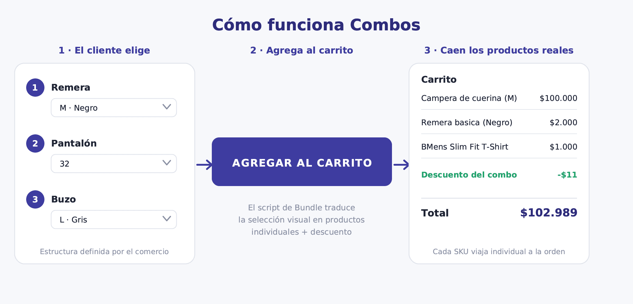
Combos and Kits render as a picker on the landing product page. There is no visual editor in Bundle: one template ships to every store, and you restyle it with CSS in your TiendaNube theme. That is enough to match colours, type, spacing, and the tone of your brand.
If you are still choosing a bundle type, start with Combos, Kit or By quantity: which bundle type to use.
What already matches your store
Before you write any CSS, publish a Combo or Kit and open its product page. Two things already follow your theme:
- The add-to-cart button. The picker copies the background, text colour, and border radius of your store's native buy button.
- The font. The panel uses the same font family as the rest of the product page.
For many stores that is all you need. Keep going only if you want the panel itself — borders, titles, discount chips, spacing — to match your brand more closely.
Where to add the CSS
Paste the rules in your TiendaNube theme's additional CSS. In most themes that is Design → Customize → Additional CSS (or Códigos CSS). Save, then reload the Combo or Kit product page.
Target the panel roots. Each offer type has its own class:
| Surface | Root class | Optional identity hook |
|---|---|---|
| Combos | .bf-mix-match |
[data-bf-bundle="…"] |
| Kits | .bf-kit |
[data-bf-kit="…"] |
| By quantity | .bf-bogo |
[data-bf-bogo="…"] |
Use the identity hooks only when you want one offer to look different from the others.
Start with colour tokens
The fastest way to change the look is to override the CSS variables on those roots. One block restyles titles, surfaces, borders, and discount chips:
.bf-mix-match,
.bf-kit,
.bf-bogo {
  --bf-primary: #1a1a1a;
  --bf-on-primary: #ffffff;
  --bf-surface: #ffffff;
  --bf-outline: #e4e4e4;
  --bf-on-surface: #161616;
  --bf-muted: #767676;
  --bf-error: #ba1a1a;
  --bf-discount: #16a34a;
  --bf-discount-bg: #f0fdf4;
  --bf-discount-border: #bbf7d0;
  --bf-btn-radius: 6px;
}
What each token controls:
--bf-primary— titles, product names, prices.--bf-surface— panel background.--bf-outline— borders and dividers.--bf-on-surface— body text.--bf-muted— hints and labels.--bf-discount,--bf-discount-bg,--bf-discount-border— savings copy and badges.--bf-error— incomplete-selection and stock messages.--bf-btn-radius— button corners, unless the native buy button already set them (see below).
Combos also expose --bf-price-struck for the struck-through list price.
If the button still looks native
The picker writes the buy-button colours as inline styles, so a normal theme rule on --bf-btn-bg will not win. Style the button class directly, or add !important on the token:
.bf-mix-match-submit,
.bf-bogo-submit {
  background: #111 !important;
  color: #fff !important;
  border-radius: 999px !important;
  text-transform: none;
  letter-spacing: 0;
}
Class hooks for type and layout
Use these when tokens are not enough — typography, padding, or hiding a piece of chrome.
Combos: .bf-mix-match-title, .bf-mix-match-description, .bf-mix-match-headline, .bf-mix-match-unit-row, .bf-mix-match-summary-amount, .bf-mix-match-submit.
Kits: .bf-kit-title, .bf-kit-section, .bf-kit-element-row, .bf-kit-element-checkbox, .bf-kit-qty-stepper, .bf-kit-summary. Kit sections also expose data-bf-kit-section-id.
Example: drop the card chrome and let the picker sit in the product column like the rest of the page.
.bf-kit,
.bf-mix-match {
  border: none;
  padding: 0;
  background: transparent;
}

.bf-kit-title,
.bf-mix-match-title {
  font-size: 1.5rem;
  letter-spacing: 0.04em;
  text-transform: uppercase;
}

.bf-mix-match-headline,
.bf-mix-match-discount-badge {
  border-radius: 999px;
}
Do not fight .bf-mix-match-header or .bf-kit-header. Those rules use !important on purpose, so host themes cannot pin the title to the viewport.
Copy you control vs copy you cannot
Name and description of the Combo or Kit in the Bundle admin become the picker title and subtitle. Kit section titles and descriptions come from the kit editor. That is the right place to match your brand voice.
Button labels, errors, and savings lines (Add combo to cart, You save 10%, and similar) are fixed in Spanish, Portuguese, and English. There is no merchant string override for that chrome.
What not to restyle
The landing product still has a native quantity field and add-to-cart button. Bundle hides those so shoppers use the picker. Do not try to restyle that hidden chrome — only the Bundle panel is yours.
The picker's inner layout is a single template. You can change colours, type, spacing, and borders. You cannot rearrange slots, swap the checkbox for a different control, or replace the widget with a custom HTML block from the admin.
Checklist
- Publish a Combo or Kit and open its product page.
- Confirm the CTA already matches your buy button.
- If you want more, paste CSS in the theme's additional CSS, starting with the
--bf-*tokens on.bf-mix-matchand.bf-kit. - Use class selectors for typography, spacing, and hiding chrome you do not want.
- Reload the product page after each change. Theme CSS usually loads after the picker stylesheet, so your rules win without
!importantexcept on the button tokens noted above.
If you need custom button copy or a fully custom layout, that is not something you can do from the admin today. Write to [email protected] and we can look at the case with you.